So we were all set and ready to print, but the workshop time ended too early, so hopefull we will be printing our poster next week.
Saturday, 28 November 2009
Letterpress continued....
So we were all set and ready to print, but the workshop time ended too early, so hopefull we will be printing our poster next week.
Monday, 23 November 2009
John Heartfield
John Heartfield is really improtant in the history of Graphic design. He was a part of the Dada movement in Berlin. Hearfield was a communist who tried to oppose the rise of Hitler through his art. In 2005, Tate Britain held an exhibition of his photomontage pieces. 
Hurrah! The Butter is All Gone! (1935)
This is one of the most famous pieces by John Hearfield. It was published on the front page of the AIZ (a German magazine) in 1935. This photomontage shows a family at a kitchen table, where nearby a portrait of Hitler hangs and the wallpaper is emblazoned by the swastikas. The family is attempting to eat the pieces of metal. At the bottom of the cover it reads "Iron has always made a nation strong, butter and lard have only made the people fat".
Saturday, 21 November 2009
The Letterpress Workshop
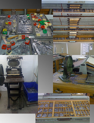
On Thursday, I had my first ever letterpress workshop, which I really enjoyed. As we were waiting for the teacher, I looked around the studio and took some photos.
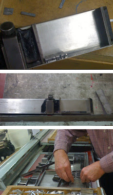
So after a bit of introduction, we managed to set our full names in 12point Baskerville u/lc range left on an 18 pica measure; which I think was a good start to letter printing. After we all had set our names, all of them were then put together using the point system in order for them to be printed.
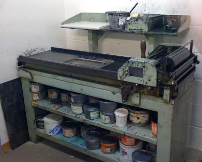
We were then introduced to the use of proofing press.
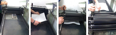
We all had a go and proof printed the names that we had set up, I really enjoyed doing the whole thing and it printed pretty well, although somehow my surname spelt Siddip instead if Siddiq. I am not sure how that happened, may be I had put a p instead of a q.
So after printing our names, we were then put into three groups and each group was given one colour for which we have come up with something that reflects the meaning of that colour which can be a quotation or part of a song and with that we will be making a poster. So rather than putting everything onto next week, we set a few sentences to go onto out poster before finishing the days workshop so that we have them ready for next week. The workshop went quite well, I am glad that i learned a totally new thing, but there's still loads more to learn about it, so i am looking forward to the next week's workshop.
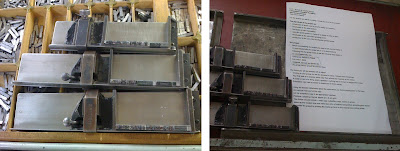
Thursday, 5 November 2009
Collages
Image Workshop
To begin with this project, first of all I did some research on artists that make collages, like Alan Fletcher, John Heartfield, Richard Hamilton, Martha Rosler, Eduardo Paolozzi, Sara Fenelli. After doing a bit f research, I managed to cut a 100 pieces of A6 card out of the paper that I had at home. Then I gathered all the material that I had been collecting since we were given this project and some that I had before. But before starting the project, I thought it would be helpful if I could look up what a collage really means, so I looked up for collage in the dictionary and the meaning of collage in the Oxford dictionary is “The art of making a picture by sticking pieces of coloured paper, cloth, or photographs onto a surface. I didn’t quite like that definition as I wanted to use materials other that as well; so then I looked up for the definition on http://www.thefreedictionary.com which was “An artistic composition of materials and objects pasted over a surface, often with unifying lines and colour.” According to this definition one can use objects other that paper, cloth and photographs as well. So now I am going to start making my collages with a hope that they turn out out very well.
Photo Cropping Workshop

Analysing Anatomical Parts of Typeface
The second task of the workshop was to analyse different parts of typeface and choose one part to look at it into more detail. So I chose letter Q as i found its tail and counters really interesting. I chose six different Qs from different typefaces, traced them indifferent colours and cut them out to have a play with them.
This is the final outcome i got with the Qs i had traced earlier. I put them in a floral sort of shape with the tails hanging out, and scanned them. i think that the way you can see through the letters seems quite interesting. I also labelled each Q with the name of the typeface it belongs to.Typography Workshop
In the typography workshop, we discussed about different typefaces and differences between typefaces and fonts. We had to choose from the given typefaces, a typeface that reflects our personality and write our name with it. I chose Bodoni Book Regular because i found that font very simple and neat and thought that it reflects my personality. 


