Thursday, 31 December 2009

Final Poster & Logo

This is my final poster with the logo on it, I think the poster works quite well but it could have been better. What I am going to do now is that I am going to take the poster to the council office and ask for their feedback and also I will try and put in the local primary school and see if children like it or not.


Wednesday, 30 December 2009

FInal Poster Development

Above are the images of my final poster, with different borders, they are all in a sequence of first to last. I tried different coloured and textured backgrounds on the poster but I thought that it’s best to have a white background may be with a border. So I did a very colourful border in the beginning, but with that everything got merged into it, then I tried making that smaller, even that didn’t work, then I tried making all that border white, which didn’t look good either. So I thought that I would just do a plain border, so I tried red, which I didn’t like, so finally I did a plain black border which I thing works quite well.

On the top right corner are the fabrics and texture materials I used to put texture onto the clothes of my characters. I put the textured effect on them t add a look of something that’s touch and feel; which I think works quite well.


The only thing I think I should do now is to put a bit of information about the trampolining club in the poster and then I think it would look alright.

Tuesday, 29 December 2009

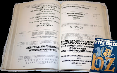
Looking at Typefaces

After Developing the poster further, and not completely being satisfied with the typeface, I thought that I would do some more research on type. So I looked at some books and also the typefaces in illustrator, which are on the left; among those typefaces, i quite liked Bell Gothic Std, Berlin Sans FB and Franklin Gothic Demi, I will try these three fonts onto my poster and will go with the one that i think looks the best. I also played around with the colours of the main heading for the poster, as i thought black looked a bit boring. I think that the one on the top looks the best, again I will try putting all of them and will choose the one that looks the best.

Monday, 28 December 2009

Poster Development


This is my first poster design, which obviously is not very good. It looks really really flat, there is no sense of motion in it and I think that it looks really boring. So, my next step is to may be change the size of the characters, make some small and some really big, I think that I will also change the typeface and the way it’s place, as it does not look very effective, the type on the top seems as it has blocked the space. I am also not too sure about putting the Woking council logo on the trampoline, i think it looks very static on it and i should move it next to the other logo.

So to add a bit of motion and excitement to the poster, what I did to start with was that i printed out different sizes of characters and stuck them in different ways using the cut and pasted technique to see composition looks the best and then i chose this composition, as i think it looks really nice, there’s a sense of motion in it, some of the character have bounced really high so they are tiny and the main character seems like he has bounced and come really close to the camera that’s why he is so big and the message he is holding of course is really important, as my message was become healthier.

In the images on above, I tried using different textured backgrounds to see which background does the poster go with.

I wrote the main text ‘Happy Trampolining’ by hand and then scanned it in live traced it and i think that it works very well as well, except for the text in the yellow board, i think that this information should be written with a proper font as it’s mainly for for parents and it should be written in proper typeface.

Sunday, 27 December 2009

Final Logos

These are the developed finalish sort of logos. The first one looks much better in colour, it’s more legible now. The second one in which i have got text now, I think looked better without the text in it, I am not really sure which one to go with really. The third one also looks quite nice, but i think that among all three this is the weakest one; so i will definitely not go for this one. After asking everyone available to me I have come to the decision that I will use the second one as my final logo, but i am still not sure wether i will use the one with or without text.

Friday, 25 December 2009

Above is the development of my very first logo, which in the end I didn’t use, as it certainly doesn’t look like a logo; it looks more like a poster.
Above is the development of the other three logos I designed after designing the very complicated one. I have tried to keep these ones as simple and basic as possible. I quite like the idea of all three of them, there is otion in all three of them. In the first one, which is abbreviation for Woking Trampoline Club, W and T are put together to make a trampoline and C is jumping on top of them, in the second one, there is a kid jumping from the trampoline, i think that I can put the trampoline instead of the bowl of B to make B a trampoline. With the third one, which I have already developed a lot, i think the last one looks perfect, I might try putting a bit of text in it as to show which organisation the logo actually is for. I think I will develop them all a bit further and then decide which one to choose as my final logo.


Thursday, 24 December 2009

Illustration Development


Before Starting to put my poster together, I designed the above characters to go onto it. I idea behind having the thier heads like that was to link the poster to my client in a way, as the shape of their heads is actually the logo for the woking council. I did try making the normal round heads as well, but i thimnk they look great as they are. The tramploine, I made it straight on illustrator using the shape tool and I think that it looks pretty alright.

Wednesday, 23 December 2009

Illustration Research

Before making my poster, I looked at children’s books Illustrators. I looked at Maurice Sendak and Dick bruna. I also looked at various cartoon characters like SpongeBob SquarePants, Jimmy Neutron, Tom and Jerry, Powerpuff Girls, Charlie and Lola, Pokemon and Simpsons to help me develop my own characters for the poster.

Further Research

Above are some of the posters I looked at for inspiration. I quite like the three on right, the on eon the extreme right is to promote healthy eating among children, which is a bit similar to my message and target audience the one before that one is also quite nice, and eye catching. I like the idea of cartoon vegtable and the type used works very well with the over all thing. The one above that, I found it inside the tube, I like that poster as it is very simple and conveys its message very effectively. So after looking at a few posters, i am now going to develop my own poster.

Tuesday, 22 December 2009

Format

After doing a bit of research I went on to choose the format for my final piece. To choose the format was one of the hardest thing to do. first I thought that I would design a poster to go on the floor which would be a bit interactive, then i thought that i would design a 3D sort of poester, but all those ideas were a bit too ambitious. In the end, I decided that after I have done a considerable amount of research on logos aimed at my target audience, I will design a logo for one of the of the sports courses held at the leisure centre, funded by the council and to show the use of that logo, I would make a poster, on which I will put my designed logo.

Before designing the logo, I further looked at some more logos, above on the left are the trampolining logos I looked up on the internet, on the right are the sports logos I found in a book called Logo Lounge. This research was very helpful for me and I was inspired by quite a few of them.


Monday, 21 December 2009

Message Research

http://www.nhs.uk/Change4Life/Pages/default.aspx?gclid=CPekjN3Ji58CFYIA4wodeheGHQ
http://www.bbc.co.uk/health/healthy_living/fitness/motivation_young.shtml
http://www.thekidswindow.co.uk/health.htm

These are the screen shots of some of the websites I consulted to look into my message. I found these websites really helpful and there were some really interesting facts in them. The best was the Change for Life website. It was very interactive, the sort of things kids would love and some very interesting facts and tips about healthy eating and healthy living.


Sunday, 20 December 2009

Logos Aimed at my Target Audience

This is the research I did on the logos aimed at 5-10 year old school going children. I could hve done it straight from internet to photohop and printed it off, but I traced them all as that was i got a good chance to observe them closely, the colours used, the typefaces, and the style. ALmost all the logos aimed at this target audience have a srt of motion in them, they use really bright colours, mostly primary and complementary colours. You can actually tell which of them are aimed at just 5-10 year old and which of them are general, for example, the Nintendo logo is quite bring and you can tell straight away that it’s not designed specifically for 5-10 year olds, the Early Learning Cantre one, may be is aimed more at mums, as usually mums do shopping for early learning of kids. I think this research has been really helpful as to understand what sort of graphics are used to attract my target audience.

Publication Aimed at my Target Audience

This is the publication research i did for my target audience. On the left are the comics i looked at and on the right are some of the bits from the comics that i like and made a sort of collage with them in my sketchbook. This research wass quite helpful as I observed what sort of colours are used for children’s publications, the typefaces used and the layout as well. All the comics were really interactive and after observing my target audience closely in various public places, I can confidently say that 5-10 year olds love interactive, bold and bright stuff.


Saturday, 19 December 2009

Target Audience

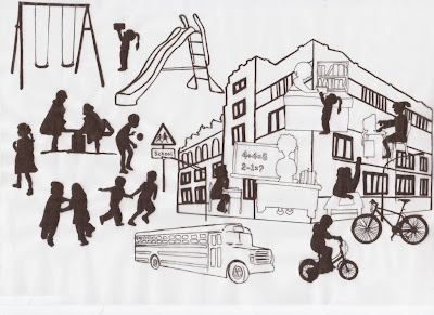
This is some initial research I did on my target audience, It’s similar to what we did in the introductory workshop, but i think in more detail. These are the tracings are of the clipart which i found on the internet, some images are from the newspaper. This research helped me closely look into my target audience, as my nephew is five years old, so asked my sister in-law about what sort of stuff he does when he’s at home so i looked up for images related to those activities and traced them. I think these tracings make a nice piece of design, I actually quite like this.

Friday, 18 December 2009

Client Research


First of all I looked at what sort of organisation my client is, similar to what we did in the uni during the first week of the project.


Above is the poster sort of thing I put together, I can't say that I designed it as the photo on the top of the poster which is sort of the main thing in the poster was taken from the council's website. So I put this information together looking at what sort of stuff my local council does for my target audience, this research is related to my message as well, as all the above activities are are somehow related to healthy living. So I looked at the afterschool sports courses held at the leisure centre and funded by the local council. This research is a good start to look into my client and quite helpful as well.

Thursday, 17 December 2009

I always have a lot of problems when I get a new project, the research bit I think is the easiest but the actual hard bit is to decide what to do for the final piece. Which I start thinking about from the beginning but still it never helps and I am always stuck at the end even after doing a lot of research. During the first week, when we got our project, we had two all day workshops, which I found very helpful to sort of kick start the project. The methods of research that we were shown and told about during the project induction week, I took them further and did my research in that sort of style.


So first of all, I did a bit of brainstorming to get myself started with the project. I asked myself what I get do for each bit to get myself started with the project.


Wednesday, 16 December 2009

Graphic Design Fundamentals

On the 10th of november, we were given our first proper sort of project. The project was Graphic Design Fundamentals i-e; Client, message and target audience. In the project, we are asked to produce and present a piece of creative graphic communication design and supporting research that meets the requirements of a client, communicates a particular message and meets the needs of target audience. We were given a choice of six clients, six messages and six target audiences, the procedure to choose our own combination, which I found really interesting and convinient was to use three dices to determine which client, message and target audience combination to work with. I really liked that procedure, as otherwise it would have taken me ages to choose from such a wide number of choices.

So the combination that I got after rolling the dices was:
Client: Local Council
Message: Become Healthier
Target Audience: 5-10 year old school going children.

I was quite happy with the combination I got as I always like to design stuff for children, and most of the projects that I had done in college were aimed at children.

Sunday, 6 December 2009

Letterpress Poster

We finally printed our poster in the 3rd workshop. I was a really good experience, letterpress most certainly is a very fun, easy and fast way of producing very effective graphic work. Below are a few photos of how we went about printing our poster..... First of all we chose the colours we wanted to print out poster with, we decided to go with a gradient look. Preparing the printer to print.....First you are supposed to roll the roller over the letters, in order to cover them with paint. Then feed the paper into the machine......The way it works is so interesting..... This is the first bit printed, now we are going to print the diagonal bit.
The diagonal part of the poster ready to print..... These are the posters all printed....

Finally the photo of the final poster.