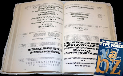


 After Developing the poster further, and not completely being satisfied with the typeface, I thought that I would do some more research on type. So I looked at some books and also the typefaces in illustrator, which are on the left; among those typefaces, i quite liked Bell Gothic Std, Berlin Sans FB and Franklin Gothic Demi, I will try these three fonts onto my poster and will go with the one that i think looks the best. I also played around with the colours of the main heading for the poster, as i thought black looked a bit boring. I think that the one on the top looks the best, again I will try putting all of them and will choose the one that looks the best.
No comments:
Post a Comment