Thursday, 31 December 2009

Final Poster & Logo

This is my final poster with the logo on it, I think the poster works quite well but it could have been better. What I am going to do now is that I am going to take the poster to the council office and ask for their feedback and also I will try and put in the local primary school and see if children like it or not.


Wednesday, 30 December 2009

FInal Poster Development

Above are the images of my final poster, with different borders, they are all in a sequence of first to last. I tried different coloured and textured backgrounds on the poster but I thought that it’s best to have a white background may be with a border. So I did a very colourful border in the beginning, but with that everything got merged into it, then I tried making that smaller, even that didn’t work, then I tried making all that border white, which didn’t look good either. So I thought that I would just do a plain border, so I tried red, which I didn’t like, so finally I did a plain black border which I thing works quite well.

On the top right corner are the fabrics and texture materials I used to put texture onto the clothes of my characters. I put the textured effect on them t add a look of something that’s touch and feel; which I think works quite well.


The only thing I think I should do now is to put a bit of information about the trampolining club in the poster and then I think it would look alright.

Tuesday, 29 December 2009

Looking at Typefaces

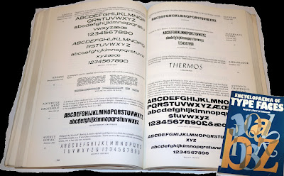
After Developing the poster further, and not completely being satisfied with the typeface, I thought that I would do some more research on type. So I looked at some books and also the typefaces in illustrator, which are on the left; among those typefaces, i quite liked Bell Gothic Std, Berlin Sans FB and Franklin Gothic Demi, I will try these three fonts onto my poster and will go with the one that i think looks the best. I also played around with the colours of the main heading for the poster, as i thought black looked a bit boring. I think that the one on the top looks the best, again I will try putting all of them and will choose the one that looks the best.

Monday, 28 December 2009

Poster Development


This is my first poster design, which obviously is not very good. It looks really really flat, there is no sense of motion in it and I think that it looks really boring. So, my next step is to may be change the size of the characters, make some small and some really big, I think that I will also change the typeface and the way it’s place, as it does not look very effective, the type on the top seems as it has blocked the space. I am also not too sure about putting the Woking council logo on the trampoline, i think it looks very static on it and i should move it next to the other logo.

So to add a bit of motion and excitement to the poster, what I did to start with was that i printed out different sizes of characters and stuck them in different ways using the cut and pasted technique to see composition looks the best and then i chose this composition, as i think it looks really nice, there’s a sense of motion in it, some of the character have bounced really high so they are tiny and the main character seems like he has bounced and come really close to the camera that’s why he is so big and the message he is holding of course is really important, as my message was become healthier.

In the images on above, I tried using different textured backgrounds to see which background does the poster go with.

I wrote the main text ‘Happy Trampolining’ by hand and then scanned it in live traced it and i think that it works very well as well, except for the text in the yellow board, i think that this information should be written with a proper font as it’s mainly for for parents and it should be written in proper typeface.

Sunday, 27 December 2009

Final Logos

These are the developed finalish sort of logos. The first one looks much better in colour, it’s more legible now. The second one in which i have got text now, I think looked better without the text in it, I am not really sure which one to go with really. The third one also looks quite nice, but i think that among all three this is the weakest one; so i will definitely not go for this one. After asking everyone available to me I have come to the decision that I will use the second one as my final logo, but i am still not sure wether i will use the one with or without text.

Friday, 25 December 2009

Above is the development of my very first logo, which in the end I didn’t use, as it certainly doesn’t look like a logo; it looks more like a poster.
Above is the development of the other three logos I designed after designing the very complicated one. I have tried to keep these ones as simple and basic as possible. I quite like the idea of all three of them, there is otion in all three of them. In the first one, which is abbreviation for Woking Trampoline Club, W and T are put together to make a trampoline and C is jumping on top of them, in the second one, there is a kid jumping from the trampoline, i think that I can put the trampoline instead of the bowl of B to make B a trampoline. With the third one, which I have already developed a lot, i think the last one looks perfect, I might try putting a bit of text in it as to show which organisation the logo actually is for. I think I will develop them all a bit further and then decide which one to choose as my final logo.


Thursday, 24 December 2009

Illustration Development


Before Starting to put my poster together, I designed the above characters to go onto it. I idea behind having the thier heads like that was to link the poster to my client in a way, as the shape of their heads is actually the logo for the woking council. I did try making the normal round heads as well, but i thimnk they look great as they are. The tramploine, I made it straight on illustrator using the shape tool and I think that it looks pretty alright.